SANSEAL COFFEE HOUSE
ROLE
Design, Art Direction
SCOPE
Brand Strategy · Visual Identity · Illustration ·
Art Direction · Environmental Design
TIMELINE
2018 — Revisited 2026
CONTEXT
REVISITING AN OLD
IDEA WITH A NEW PERSPECTIVE.
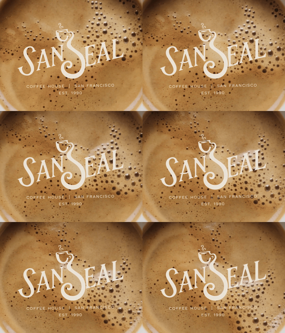
Sanseal began as an early identity exploration inspired by San Francisco coffee culture. Years later, I revisited the concept to explore how atmosphere, personality and local character could transform a simple logo into a more distinctive brand world.


The original identity used the Golden Gate Bridge as its primary expression of place.
"Could Sanseal feel distinctly San Francisco without relying on San Francisco's
most recognizable landmarks?"
THE PROBLEM
BEYOND THE LANDMARK.
The first concept communicated where Sanseal belonged. The new challenge was creating a visual language that gave Sanseal a character of its own.
DISTINCTIVE.
ROOTED.
CHARACTERFUL.
FLEXIBLE.


Exploring how place, coffee culture and the Sanseal name could intersect before moving toward a more ownable identity.
PROCESS
FROM LANDMARK TO LANGUAGE.



ART DIRECTION
WARMTH IN THE FOG.
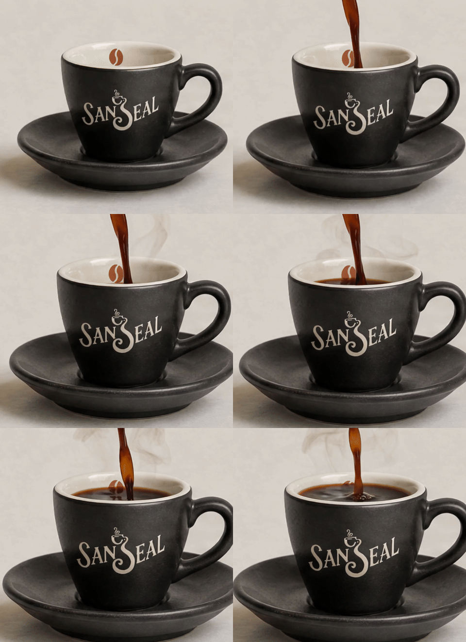
Inspired by the contrast between San Francisco's cool, foggy atmosphere and the warmth of a neighborhood coffee house, the art direction balances quiet city moments with human connection, ritual and texture.
Content Pillars:
FOG · RITUAL · CONNECTION · WARMTH

SAN FRANCISCO, 7:19AM
A little warmth goes a long way.


THE SYSTEM
BRAND WITH CHARACTER.
THE LOGO
THE COLORS
FOG
#71898B
BRIDGE
#C95432
CREAM
#F1EBDD
ESPRESSO
#2A2926
DEEP GREEN
#17634F
THE TYPOGRAPHY
THE ICONOGRAPHY
THE RESULT
FROM LANDMARK TO LANGUAGE.
Sanseal evolved from an identity built around a recognizable symbol of San Francisco into a flexible brand world shaped by atmosphere, ritual and character.