BUIDLING A CONNECTED RETAIL EXPERIENCE
ROLE
Director, Product & Design / Art Director
SCOPE
Retail Strategy • Creative Direction • Retail Merchandising • E-Commerce Creative
Holiday Campaign • Packaging Integration Photography Direction • Cross-functional Leadership
TIMELINE
2024-Current
TEAM
Ashley Espinoza,
Director, P&D / Art Director
Creative Strategy • Art Direction • Retail Strategy Holiday Collection Design • Photography Direction
Emma Chisholm,
Senior Graphic Designer
Retail Production • Creative Execution
Production Artwork

SUMMARY
Expanding City Beauty Beyond DTC
As City Beauty expanded into major retail partners including Macy's and Walgreens, the challenge extended beyond designing displays. Every customer touchpoint—from in-store merchandising to digital shopping and holiday campaigns—needed to work together as one cohesive brand experience.
Rather than treating retail, packaging, and e-commerce as separate initiatives, we developed a connected creative system that maintained consistency across physical and digital environments while supporting future retail growth.
THE CHALLENGE
ONE BRAND. MULTIPLE SHOPPING EXPERIENCES.
As City Beauty expanded into national retail, every environment—from department store fixtures to e-commerce listings—required a tailored creative approach while preserving a single premium brand experience.
Challenges
-
Launch City Beauty into national retail without losing premium brand equity.
-
Create merchandising systems that educated customers and drove discovery.
-
Extend the in-store experience across e-commerce and seasonal campaigns.
-
Align cross-functional teams to deliver a cohesive customer journey.
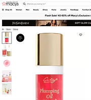


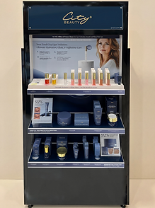
Creative direction was carried across in-store displays, digital merchandising, and seasonal collections to create one connected retail experience.
PROCESS
DESIGNING THE OMNICHANNEL JOURNEY.
Rather than designing isolated deliverables, we mapped every point where customers would encounter the brand—from discovery to purchase
and beyond.
KEY INSIGHT
Every creative decision—from packaging to digital merchandising—was evaluated based on how it contributed to one cohesive customer experience rather than an individual deliverable.
01 Creative Strategy
Defined the creative direction by aligning customer expectations, retail merchandising trends, and City Beauty's premium positioning before a single asset was designed.
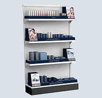
02 Retail Experience
Translated the strategy into merchandising systems that improved product discovery, simplified navigation, and elevated the in-store shopping experience.
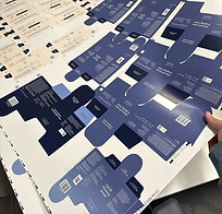
03 Packaging System
Developed packaging that balanced shelf visibility, customer education, and scalable production while supporting a cohesive retail presentation.
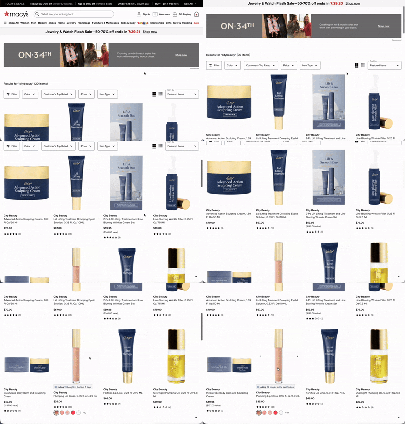
04 Digital Experience
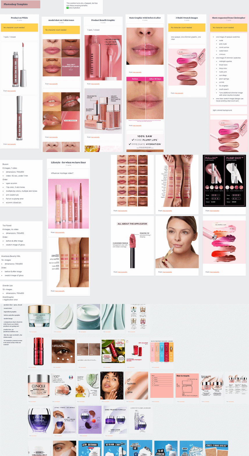
Extended the in-store experience online through cohesive collection pages, merchandising graphics, and product listing imagery.
.jpeg)
05 Holiday Collections
Expanded the retail ecosystem with seasonal gifting that introduced new purchase occasions while maintaining a consistent brand experience.
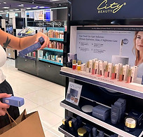
06 Customer Experience
Unified every touchpoint into a seamless shopping experience that encouraged product discovery and reinforced City Beauty's premium positioning.
PROPOSAL
DESIGNED FOR CUSTOMER DECISION-MAKING.
01
Rather than organizing products by SKU alone, the retail systems were structured around how customers naturally shop. Product placement, messaging, and visual hierarchy were intentionally designed to reduce decision fatigue while encouraging product discovery and routine building.
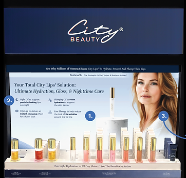
HERO FIRST
For both Macy's and Walgreen displays, City Lips was placed at eye level as the hero category to maximize visibility and immediate brand recognition.
-
Hero Category Placement
Positioned City Lips at eye level to maximize visibility and reinforce the brand's hero product. -
Routine-Based Education
Framed products as a complete lip-care routine rather than individual SKUs to encourage cross-selling. -
Lifestyle & Credibility
Combined aspirational imagery with educational messaging to create trust without sacrificing conversion.
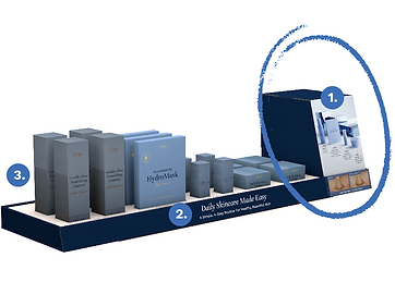
ROUTINE BUILDING
Essential daily-care products were organized separately to provide an approachable entry point for customers beginning a skincare routine.
-
Routine Building
Organized products around an easy-to-understand daily routine, making skincare approachable for customers new to the brand. -
Reduced Choice Overload
Limited the assortment to essential products, helping shoppers make confident purchasing decisions. -
Educational Display
Combined lifestyle imagery, product education, and benefit-driven messaging to encourage product discovery.
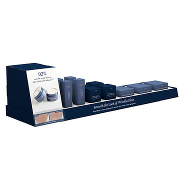
LIFESTYLE EXPANSION
Body care completed the shopping journey by expanding beyond facial skincare and increasing opportunities for cross-category discovery.
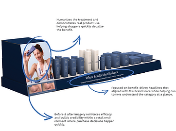
TARGETED SOLUTIONS
Treatment products were grouped together so customers shopping with a specific concern could quickly locate relevant solutions.
CREATIVE DIRECTION
The visual language was intentionally simplified to strengthen brand recognition within busy retail environments.
Key Decisions
-
Primary City Beauty blue became the dominant visual anchor.
-
Product photography introduced warmth and emotional connection.
-
White shelf structures created contrast for improved product visibility.
-
Gold accents remained reserved for products rather than backgrounds.
-
Information hierarchy guided shoppers from category → product → benefit.
Rather than introducing new retail-specific colors, we leaned into City Beauty's signature blue to reinforce brand recognition across every touchpoint. The neutral foundation allowed product packaging, photography, and merchandising messages to create contrast without competing for attention.

PROPOSAL
02
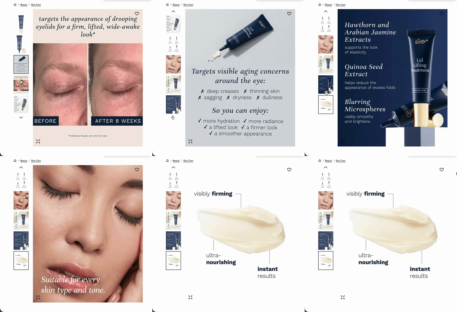
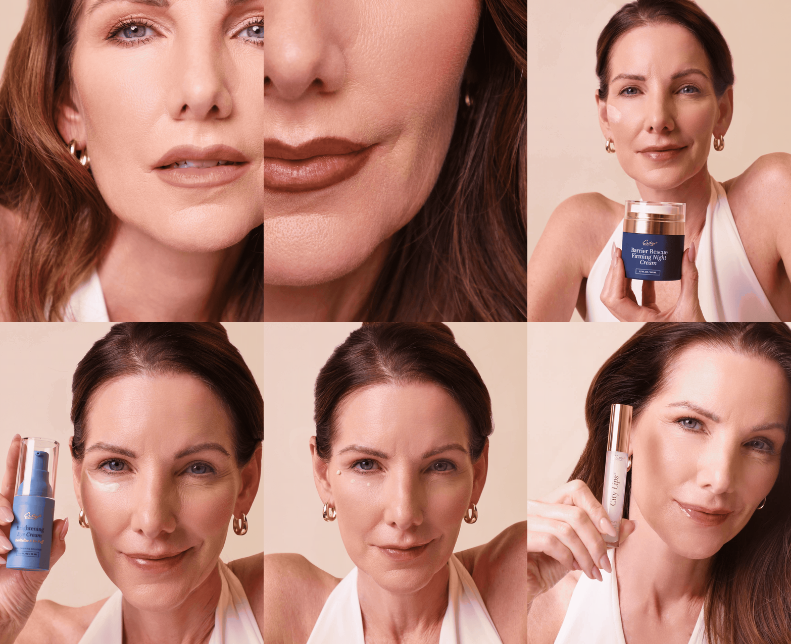
Building an Omnichannel Brand Experience
Built a unified customer experience by connecting retail merchandising, packaging, photography, and digital commerce into one cohesive brand system.

PROPOSAL
03
Expanding the System Through Seasonal Gifting.
Designed the City Lips Minis Collections and Lift & Smooth Duo as a seasonal gifting experience that expanded the retail ecosystem while maintaining consistency with City Beauty's premium brand positioning.
My Role: Concept Development • Packaging Design • Creative Direction

RESULTS
BUSINESS IMPACT
Rather than designing a single retail display, this project established City Beauty's first scalable retail ecosystem across physical stores, ecommerce, merchandising, and seasonal campaigns. The system supported national retail expansion while creating new purchase opportunities and a repeatable framework for future launches.
100X ABOVE FORECAST
Exceeded Macy's initial forecast of 5,000 online orders per month, generating approximately $500K in first-year ecommerce revenue.
HOLIDAY COLLECTION SOLD OUT
The City Lips Mini Collection sold through in multiple Macy's locations, validating seasonal gifting as an additional retail purchase occasion.
ACCELERATED LAUNCH
Delivered merchandising, creative assets, packaging, ecommerce, and retail fixtures within an accelerated 1–2 month retail timeline.
NATIONAL ROLLOUT
Created a scalable merchandising system supporting rollout to 32 Macy's stores nationwide, with adaptable frameworks later extended to Walgreens.