A NEW PACKAGING DESIGN SYSTEM & IDENTITY
ROLE
Director, Product & Design / Art Director
SCOPE
Packaging Strategy • Brand Systems • Product Architecture • Production Oversight
TIMELINE
2023-Current
TEAM
Emma Chisholm,
Senior Graphic Designer

SUMMARY
City Beauty had built strong brand recognition through its signature blue-and-gold packaging system. However, as the product portfolio expanded, the packaging architecture was becoming increasingly difficult to scale.
Leadership approved the redesign under one critical condition:
The new packaging system needed to cost the same—or less—than the existing packaging.
The challenge was to create a more modern, differentiated, and scalable packaging system while maintaining brand recognition and reducing production costs.
THE PROBLEM
OUR PACKAGING WAS RECOGNIZABLE, BUT NOT BUILT FOR EXPANSION.
Customer Experiences Challenges:
-
Limited product differentiation.
-
Weak benefit hierarchy
-
Difficult portfolio navigation
Brand System Challenges:
-
Inconsistent metallic finishes
-
Dated visual execution
-
No scalable packaging framework
Business Challenges:
-
Cost-neutral redesign requirement


Portfolio-wide audit revealed inconsistencies in metallic finishes, visual hierarchy, and SKU differentiation.
AUDIT
OPPORTUNITY FOR OPTIMIZING UNDERSTANDING & GROWTH.
AUDIT AREAS
-
Differentiation
-
Hierarchy
-
Production Quality
-
Scalability
KEY FINDINGS
-
Premium finishes were driving unnecessary costs
-
Metallic executions lacked consistency across formats
-
The system wasn't built to scale with future launches
-
The visual language felt dated against prestige competitors
-
Claims and benefits lacked hierarchy and visibility


RESEARCH
THE RESEARCH REVEALED
3 OPPORTUNITIES
TO STRENGTHEN
THE SYSTEM.
01
Softer palettes resonated with mature consumers.
Women in City Beauty's target demographic showed a preference for softer, more refined color palettes over highly saturated alternatives.
02
Monochromatic packaging increased premium perception.
Research found monochromatic packaging was often perceived as more modern, premium, and trustworthy.
03
Packaging influenced purchase intent.
Clear visual hierarchy and recognizable packaging cues played an important role in purchase consideration.
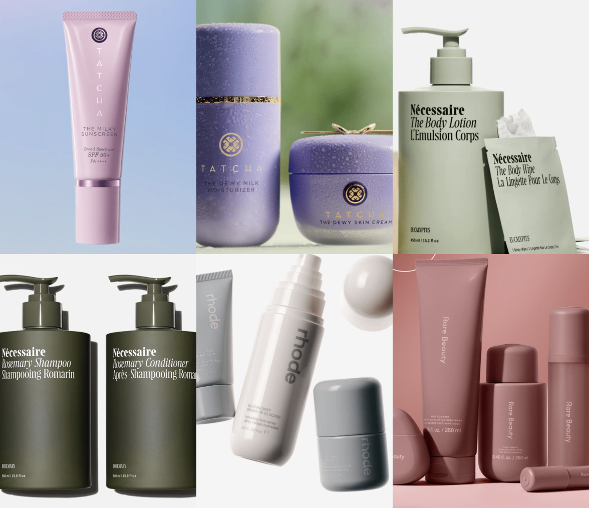
Monochromatic packaging systems used by leading prestige beauty brands.
STRATEGY
A FRAMEWORK FOR EVERY DESIGN DECISION.
01
Build for scale.
Develop a system capable of supporting future launches.
02
Improve customer navigation.
Help customers identify products and categories faster.
03
Modernize the brand.
Create a more contemporary prestige beauty experience.
04
Preserve premium perception
Maintain quality cues while refining execution.
05
Optimize production costs.
Optimize materials and specifications where possible.
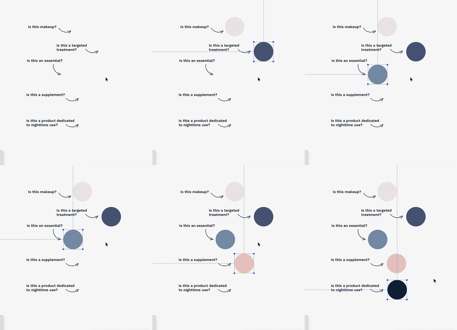
We explored how color could help customers quickly identify product categories while supporting future portfolio expansion.
PROPOSAL
BUILDING A PACKAGING SYSTEM DESIGNED FOR SCALE, CLARITY & EFFICIENCY.
01
Line Architecture System.
A new color-based architecture was developed to help customers quickly identify product categories while creating a scalable framework for future launches.
Each category was assigned a distinct visual territory to improve product recognition, simplify navigation, and support future product launches while maintaining a cohesive City Beauty identity.
MAKEUP
Soft nuetral associated
with beauty and cosmetics.`
TREATMENTS
Deeper blue signals targeted solution and efficacy.
ESSENTIALS A
Approachable, everyday products designed for routine use.
ESSENTIALS B
Approachable, everyday products designed for routine use.
SUPPLEMENTS
Warm, wellness-inspired color differentiates ingestibles from topical products.
NIGHTTIME
Communicates evening
use and recovery.
.png)


This system eliminated ambiguity between product types and provided internal teams with a repeatable framework for future product development.
PROPOSAL
02
Packaging Hierarchy & Customer Experience.
The packaging hierarchy was redesigned to improve product understanding both before and after purchase.
UNIT CARTON
-
Added product windows to showcase City Lips shade variations
-
Increased visibility of product benefits and key claims
-
Added QR codes to support deeper product education
-
Introduced credibility cues and research-backed messaging
-
Explored branded storytelling elements within the carton structure
SCREEN PRINT
After opening the carton, customers often relied solely on the primary package.
To improve that experience, we introduced:
-
Action-oriented descriptors
-
Benefit-driven product naming support
-
Improved information hierarchy
-
More concise, scannable copy


PROPOSAL
03
Elevating Premium Perception
The visual language was modernized to better align with prestige beauty expectations while preserving recognizable brand equity.
Key Updates
-
Simplified packaging architecture
-
Improved product hierarchy
-
Reduced visual clutter
-
Refined metallic finishes
City Lips retained metallic accents as a key brand equity cue. Rather than removing them, the finish was refined from a yellow gold matte to a champagne rose-gold metallic, creating a more elevated appearance while reducing perceived color inconsistencies across the line.
.jpg)
City Lips Plumping Lip Gloss transitioned from a yellow gold matte cap to a champagne rose gold shiny cap. This immediately elevated the product and perception.
PROPOSAL
04
Designing for Efficiency Without Compromising Premium Perception
One of the project's primary objectives was reducing packaging costs while maintaining the premium perception City Beauty customers expected.
To identify savings opportunities, I evaluated packaging structures, coatings, decoration methods, component finishes, and material specifications across the portfolio.

Removed soft-touch coatings
Maintained a premium matte appearance while eliminating a coating option that could reduce packaging costs by up to 19% depending on application.

Reduced metallic component usage
We replaced gold caps on most products with monochromatic components
and reserved metallic accents for hero products where they provided the greatest brand value.

Standardized packaging specifications
We simplified printing specifications across product categories
and reduced complexity and improved consistency.

Evaluated packaging structures
Compared single-wall and double-wall carton constructions and we balanced perceived value against production cost.
RESULTS
A PACKAGING SYSTEM BUILT TO SCALE
The redesign established a scalable packaging system that unified the growing product portfolio while preserving City Beauty's premium identity. By standardizing packaging architecture, refining information hierarchy, and optimizing production specifications, the redesign created a repeatable framework for future launches.
Key Outcomes
-
Established five distinct product line identities
-
Improved customer navigation across the portfolio
-
Standardized packaging specifications for future development
-
Reduced production costs while maintaining premium perception
-
Created a scalable system supporting future product launches
.jpg)
The result is packaging that has an easier product recognition, a repeatable system, and helps support future launches.
RESULTS
01
The System in Practice
The redesigned packaging system now spans City Beauty's growing portfolio, providing a repeatable framework for future product launches while maintaining a cohesive premium identity.
-
35+ SKUs
-
5 Product Lines
-
Multiple Packaging Formats
-
One Cohesive System

RESULTS
PACKAGING REFINEMENT
Unit Carton Improved shelf communication and product education through clearer hierarchy, product windows, and credibility cues.
Primary Packaging became easier to understand after unboxing through benefit-first messaging and action-oriented descriptors.


RESULTS
COST OPTIMIZATION
THROUGH DESIGN
Designing for Efficiency Without Compromising Premium Perception
Reducing packaging costs was a key business objective throughout the redesign. Rather than applying broad cost-cutting measures, every packaging decision was evaluated against its impact on customer perception, manufacturing efficiency, and long-term scalability. The result was a system that balanced operational savings with a premium brand experience.
Matte AQ Unit Cartons
Replaced soft-touch coatings while maintaining a premium matte finish, identifying 3–14% cost savings depending on packaging format.
Monochromatic Components
Replaced metallic caps across most product lines, creating 6–31% savings per unit while improving production consistency.
Packaging Structure Evaluation
Compared single- and double-wall constructions to balance perceived value against manufacturing costs.
Standardized Specifications
Simplified decoration methods, finishes, and production specifications to reduce complexity across the portfolio.
OTHER PROJECTS


